
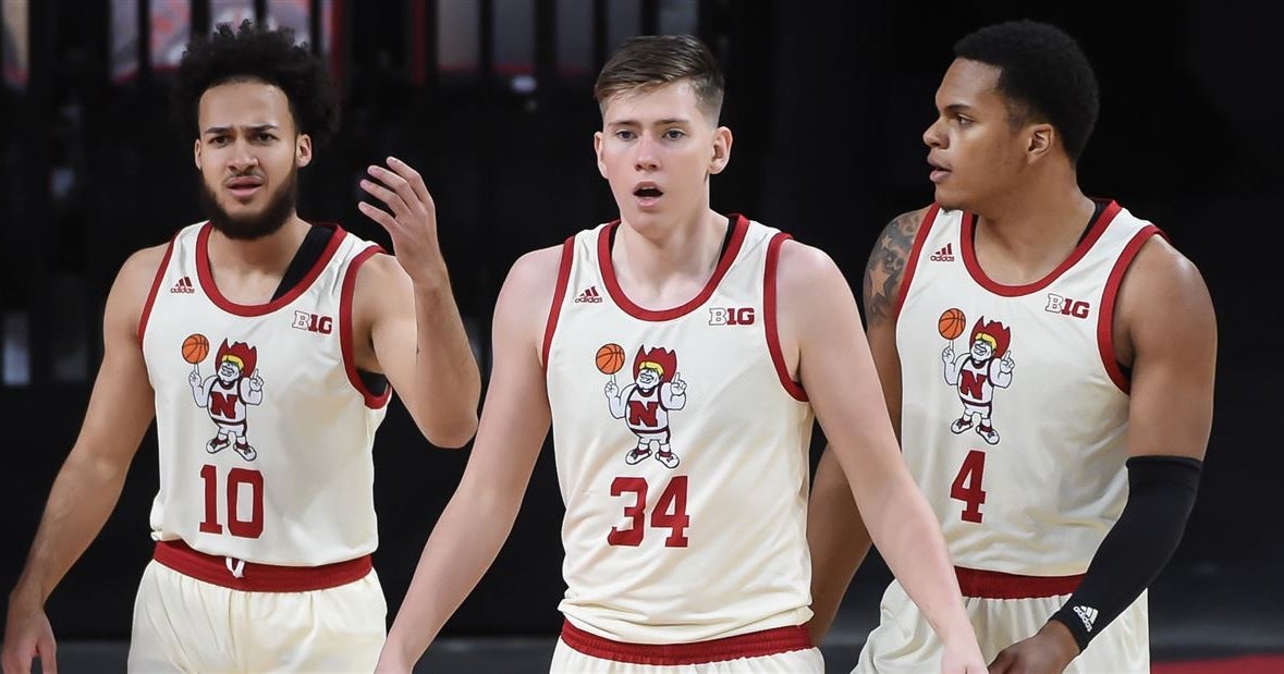
Maybe already a thread about it, but I think the herbie husker ones are among the best in the conference.
🤢🤮Maybe already a thread about it, but I think the herbie husker ones are among the best in the conference.
BUT BUT BUT BLACK ISNT A SCHOOL COLOR.I don’t really like the Herbie Husker logo on the front, but the uniform we wore Monday - all black with the block “N” on the front looked good.
BUT BUT BUT BLACK ISNT A SCHOOL COLOR.
I like them as well.
Don't mind these but the black with the N and number below are ugly.Maybe already a thread about it, but I think the herbie husker ones are among the best in the conference.
Yep, a logo on the front just does not work.I don't like the jerseys with logos on the front in place of the team name. Just doesn't look right to me. But if there's any way to pull it off, it's Hoops Herbie.
Outsider here
I dont mind the logo jersey but the cream color is gross. I like the ones you have that have the cursive script on them.
Love the cursive script myself, but I love the cream home uniforms minus fat herbie, also like when Oklahoma wears them in football..
Think it would be best to leave a logo off the front like someone else suggested.Love the cursive script myself, but I love the cream home uniforms minus fat herbie, also like when Oklahoma wears them in football..
